project 1
Philippine Airlines
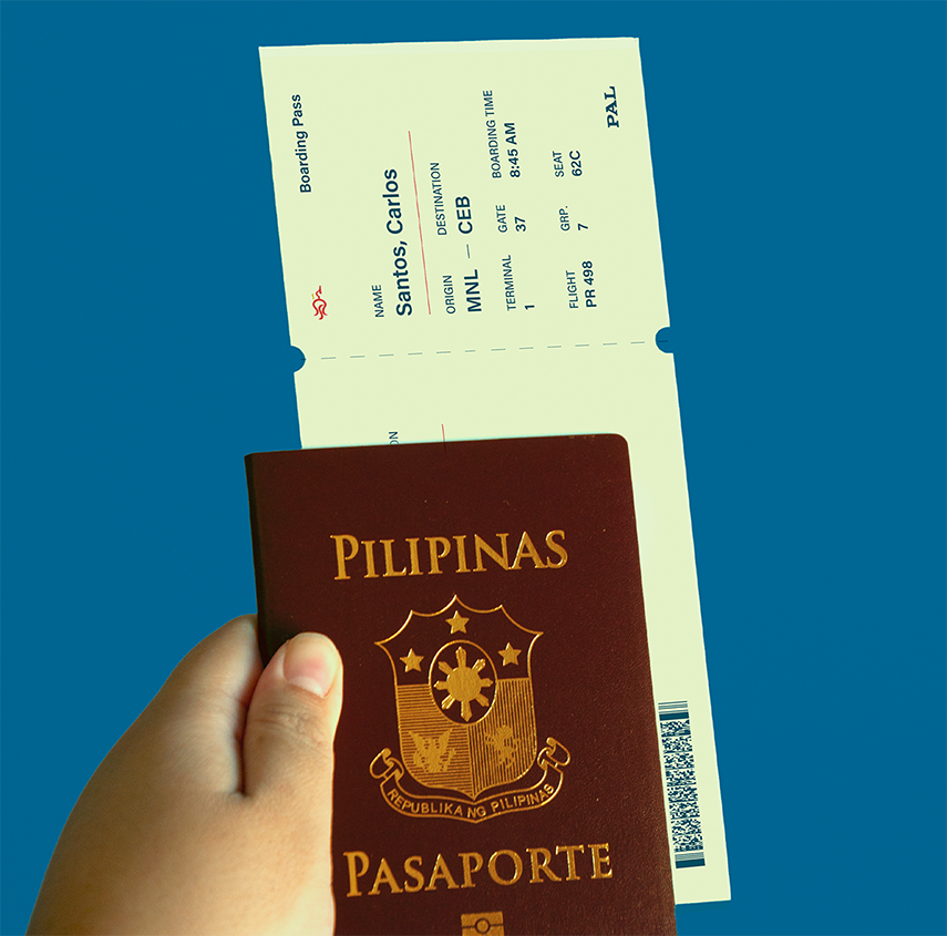
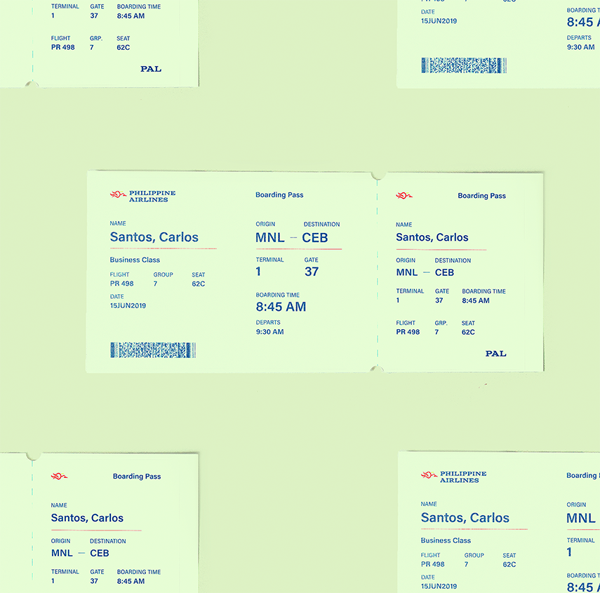
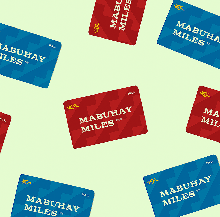
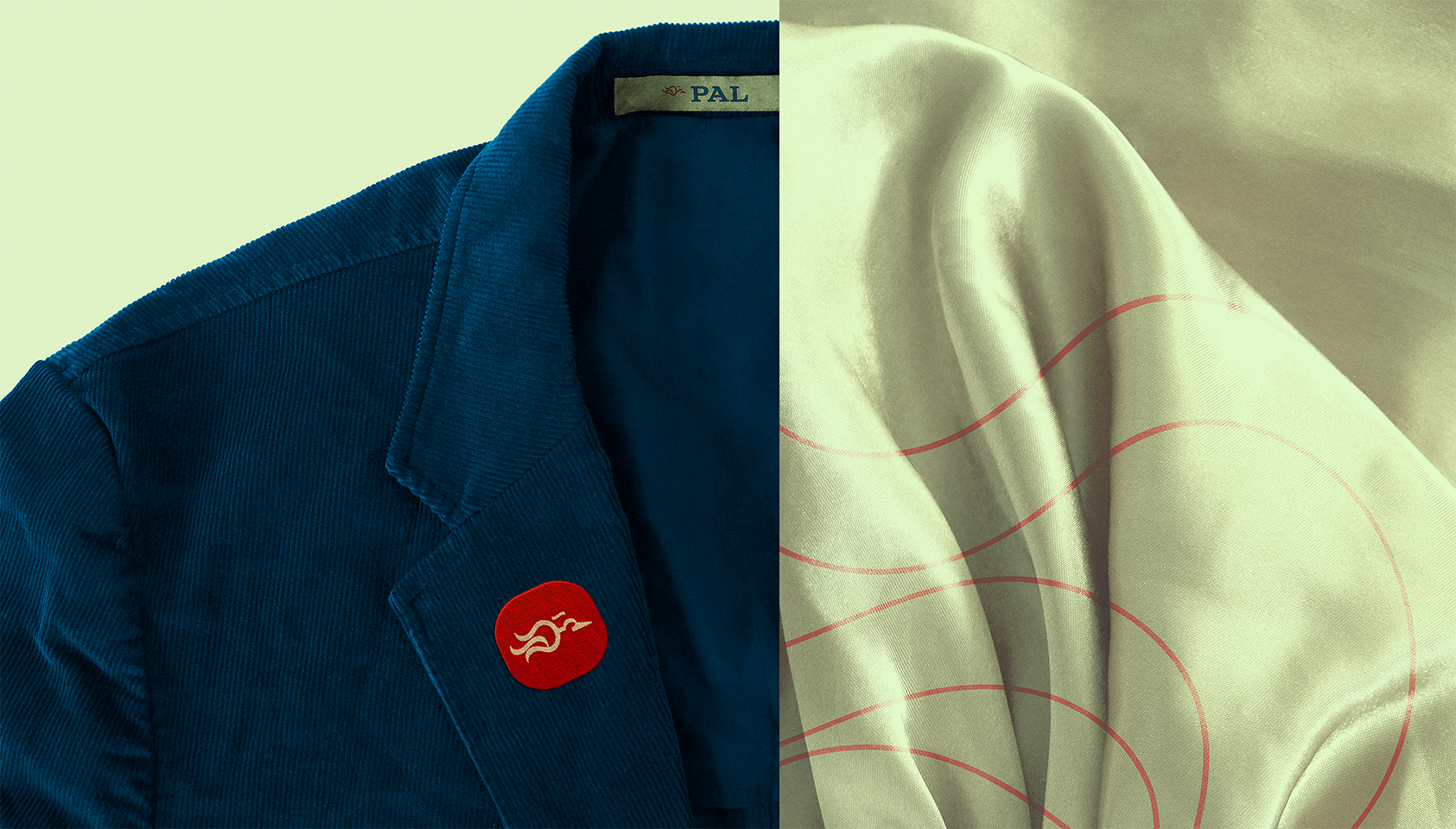
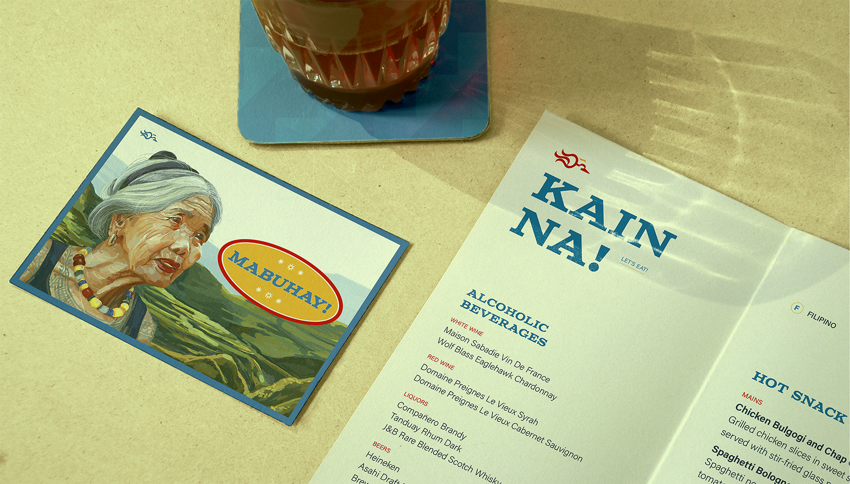
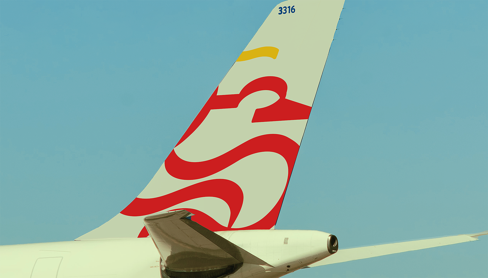
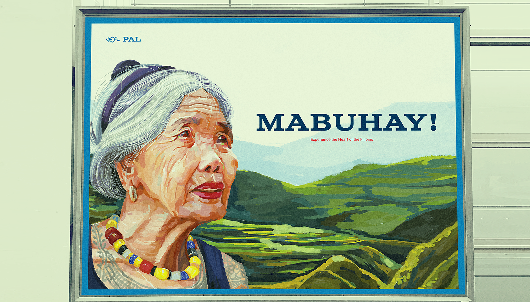
This rebrand of Philippine Airlines aims to shy away from its previously “westernized” identity. This new identity system dons the country’s national colours to further emphasize Filipino pride and individuality. Hangin ( air in Tagalog ) was loosely translated from the Baybayin alphabet, which is an ancient Filipino script. Part of the letterforms were then modified to form the Philippine eagle logomark. A careful mix of vintage and modernity was intended to give a sense of nostalgia, while still estabilishing a professional, sleek look.
The dining menu, uniform set, Mabuhay Miles cards, passport, and boarding pass are all original photography. Other mockups are sourced frommr mockup.
Type
Brand Identity
Illustration
Photography
Tools
Adobe:
Illustrator
Photoshop
InDesign
Nikon d5000
Timeline
3 weeks